 In late 2015, the City of Richmond initiated a Transit Network Plan. JWA, together with planning firm Michael Baker International, has been helping the City analyze the current bus network of Richmond, and reconsider the design of the network in the context of a changing city and the new Pulse BRT. The City’s Richmond Transit Network Plan is exploring a wide range of future transit networks in Richmond.
A report examining the existing network and outlining major transit choices for the city was released in May 2016. This summer, the public and decision-makers will be asked to look at three very different network concepts, designed to achieve three different goals. Because these goals cannot all be maximized at once, within a fixed budget, they trade-off against one another. The City wants to know how its residents and stakeholders would make those trade-offs.
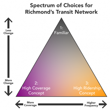
The triangle above represents the two major choices Richmond faces in planning the future of its transit network: how much to change the network, and whether to shift towards higher frequencies and higher ridership, or to continue providing high coverage (but with low frequencies). Both of these choices invite people to locate their opinion on a spectrum, from top to bottom and left to right. The final Richmond Transit Network Plan will represent a point in this triangle. The question now, for Richmond, is: Where in this triangle do you want your city to be?
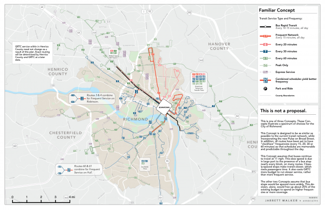
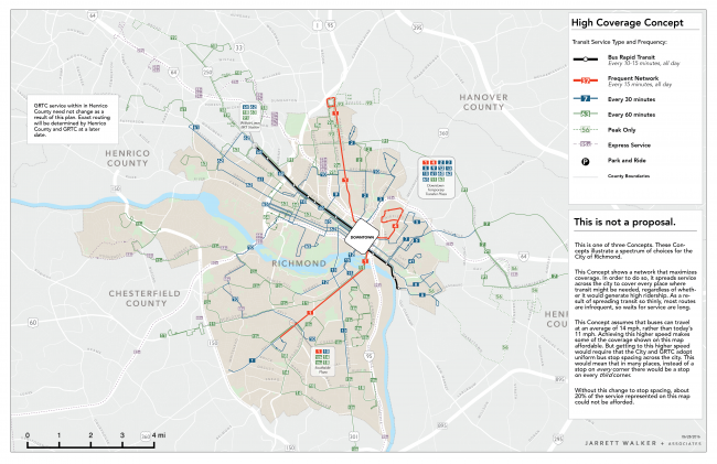
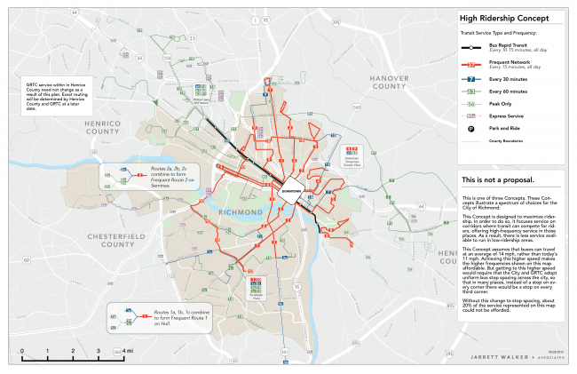
The three transit network concepts are mapped below (and on the project webpage). On each map, brighter colors mean higher frequencies. BRT is shown in black.
These three Concepts all assume a basic change to transit scheduling: all routes would be set to recurring “clockface” frequencies (every 15, 20, 30 or 60 minutes) so that buses come at predictable times, all day. Even the Familiar Concept includes this change. In contrast, existing transit routes in Richmond have somewhat or very variable frequencies, with hard-to-predict gaps between arriving buses.
Another change that is hard to see on the map is to bus stop spacing and, relatedly, bus speeds. Today, many Richmond transit routes have bus stops every single block. As a result, bus speeds are slow, which affects passengers’ travel times and the transit agency’s costs for any given route. If bus stops were thinned-out to every 3rd block, buses would go faster, saving time and money, but some people would have to walk a little farther. The High Coverage and High Ridership Concepts assume wider stop spacing, faster speeds and lower costs, and as a result they offer more service. The Familiar Concept does not assume this change: bus stops would still be very close together, buses would be slow, and each route would be more expensive to provide.
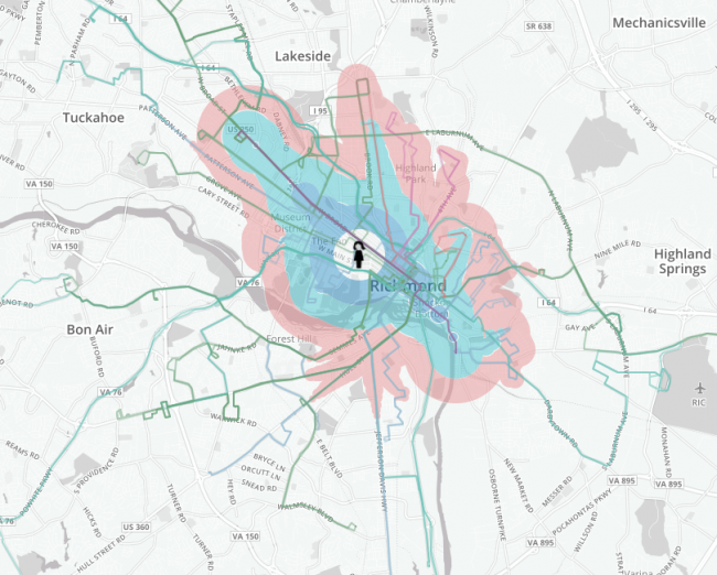
These maps aren’t the only tool that stakeholders, elected officials and members of the public will be using to compare their transit choices. Over the past two years, JWA has deployed and encouraged our clients to consider different methods of comparing transit access using isochrones, maps that compare people’s transit access.
- Familiar Network Concept
- High Coverage Network Concept
- High Ridership Network Concept
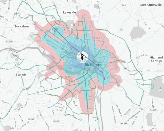
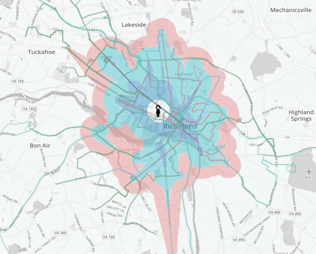
These images are an example of a common tool used for this purpose – each shows the area from which a person could commute to Virginia Commonwealth University in Richmond, in 15, 30, 45 or 60 minutes by transit plus walking, across the three different Network Concepts.
This sort of visualization is pretty common around the web for existing transit networks, because a number of software packages can be easily configured to generate isochrones from a transit GTFS feed. However, because transit plans typically are presented to the public before a schedule exists, comparative isochrone visualizations are rarely used in communicating the benefits of a project in this way. Thanks to Remix, the data needed to generate isochrones for proposed transit plans is easier to develop than ever before. This means that members of the public can now use isochrones to evaluate network proposals, early in a planning process.
Furthermore, we are now able to present (thanks to the hard work of staff at Michael Baker International) an interactive tool that allows anybody to compare their isochrones from any location under different network alternatives:
People in Richmond are being asked which of these Network Concepts best serves their own values for transit, or where – in the space between them, in the triangle above – they want the City to be.
More information, and a number of isochrones for more places in Richmond, is available at the project webpage.

